Logos

Defining a Connection

An organization's logo is the leading point of first impressions and the visual cornerstone of ongoing relationship.

As with all design work, logo design projects require that we enter fully into the vision of each client and the perspective of their audience as we craft the graphic that represents their connection.

Logo/Identity Design

Wild Leaven Bakery

Master baker Andre Kempton prefers to work by hand and relies on wild-harvested ingredients, so the identity for the organic-leaning cafe needed to include a wild edge balanced with a clean feel

The logomark draws its three-armed form from the Celtic trinity knot, an important influence for the baker

Signage includes boards used for the local farmers market

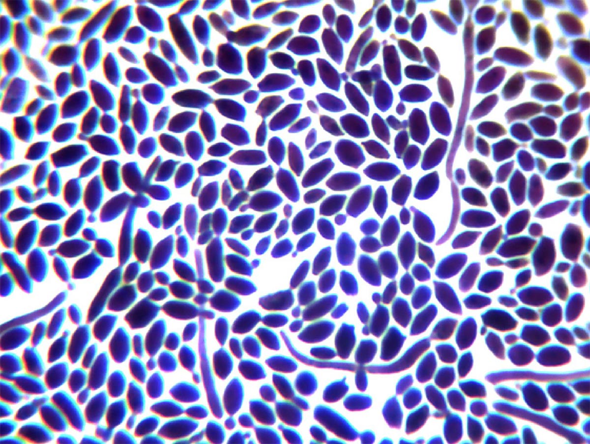
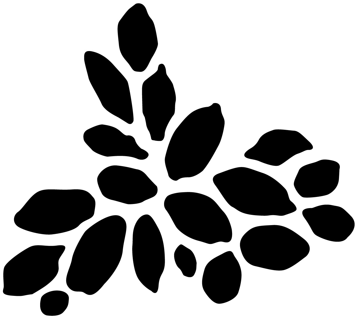
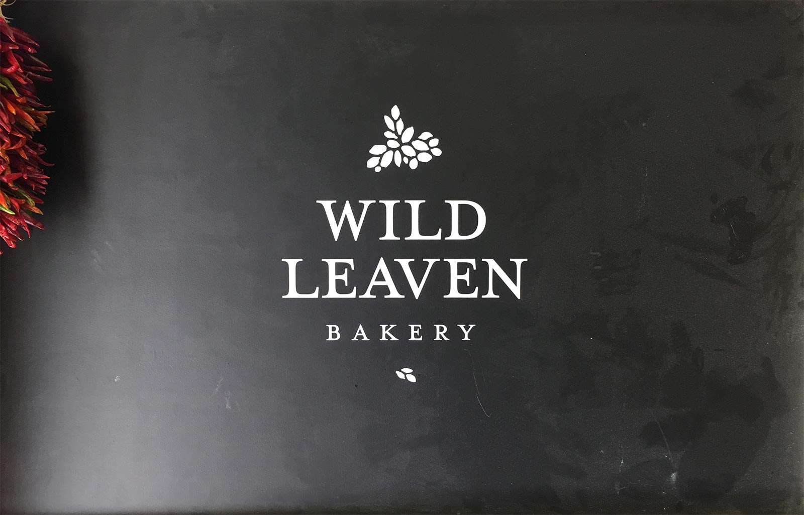
The logoform is composed of modular yeast grains, the building blocks of the bakery's trademark sourdough
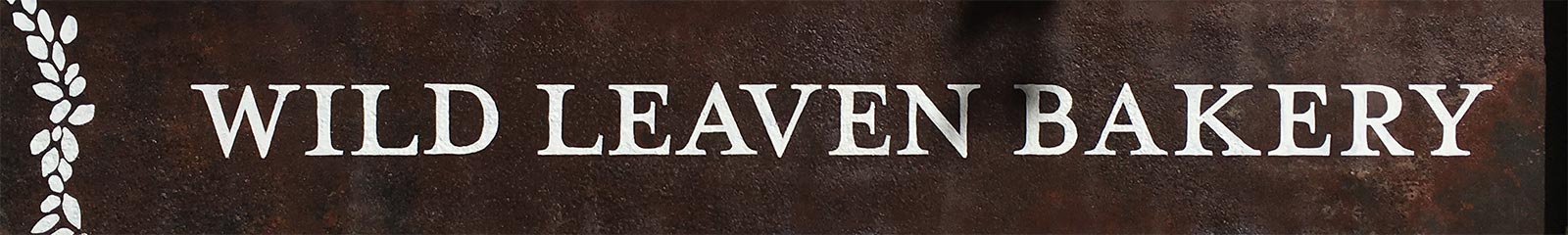
Building With Heart

Alternative builder Chuck Bell brings 15 years of experience to his projects, enabling him and his crew to generously balance personal, technical and environmental needs. A primary challenge in the project, and hopefully its success, is the representation of "heart" in the largely masuline context of the building profession.

The typography balances bold, classic lines with warm details, while at small sizes the heart outline of the logomark becomes clear

At larger sizes the asymmetrical logomark suggests two hands at work, as well as the natural forms of a branching tree (nature & wood) and a grain head (used in strawbale construction)

klaza

Simplicity and clarity are two keys in the approach of the online classifieds startup, so the logo communicates both principles along with an energy that instills confidence

Bringing together buyer and seller from different locations

Phillips ADR

Following the firm's commitment to "A relentless approach to resolution," the logomark stands between the title's two words (the name and the acronym, the bold and medium, the first and the last, etc), uniting them while paying full respect to each.

The round form in relationship to the type hints at the rising sun, a reference to coming clarity.

The underlying form feels disordered and full of competing interests

The unifying ring not only brings an overriding order, it also reveals a target

At the center of the mark, a subtle eye form suggests seeing and wisdom

Details for the backlit interior signage

Phillips Pictures

Filmmakers Parker and Graham Phillips wanted their logo to feel interesting and sharp, though not simply modern. The final wordmark and separate logomark hint at an underlying story, reflecting the brothers' co-writing approach.

Early prototypes played with camera bracket marks

The compact double-P design carries a sense of illusion and narrative, inviting engagement