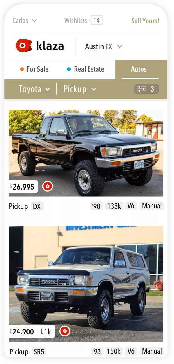
An Autos search with the default options displayed at a glance including year and mileage.


Envisioned as a direct challenger to Craigslist, the 2012 startup aimed to create a classifieds interface that was not only good looking but pleasing to use.
The managing agency offered me a lot of flexibility so I imagined a number of new interface approaches crafted around the experiences of searching, discovering and reviewing listings as well as giving sellers better tools.
Web Application
Product Strategy User Experience (UX) User Interface (UI) Front-end development
I recognized early that the key to clarity in the search process was to include the essential information in each listing (and nothing more).
Because needs vary by person, the design aims for just enough information by default with the ability to fine-tune what's displayed in each listing through search filters.
An Autos search with the default options displayed at a glance including year and mileage.
For Real Estate, Autos and For Sale items, types of data can be shown or hidden in listing cards. And, specific listing types can be excluded from the results altogether


Shoppers can also keep results generalized
Real Estate searches pair the filters with a map for more dynamic results

An expanded view of a listing continues the theme of "right information" for easier visual processing, which then enables the design to include additional features

The expanded listing view includes a Comments tab to encourage a sense of community and to address common questions publicly
The dashboard design includes business details such as metrics as well as tools for engagement and management
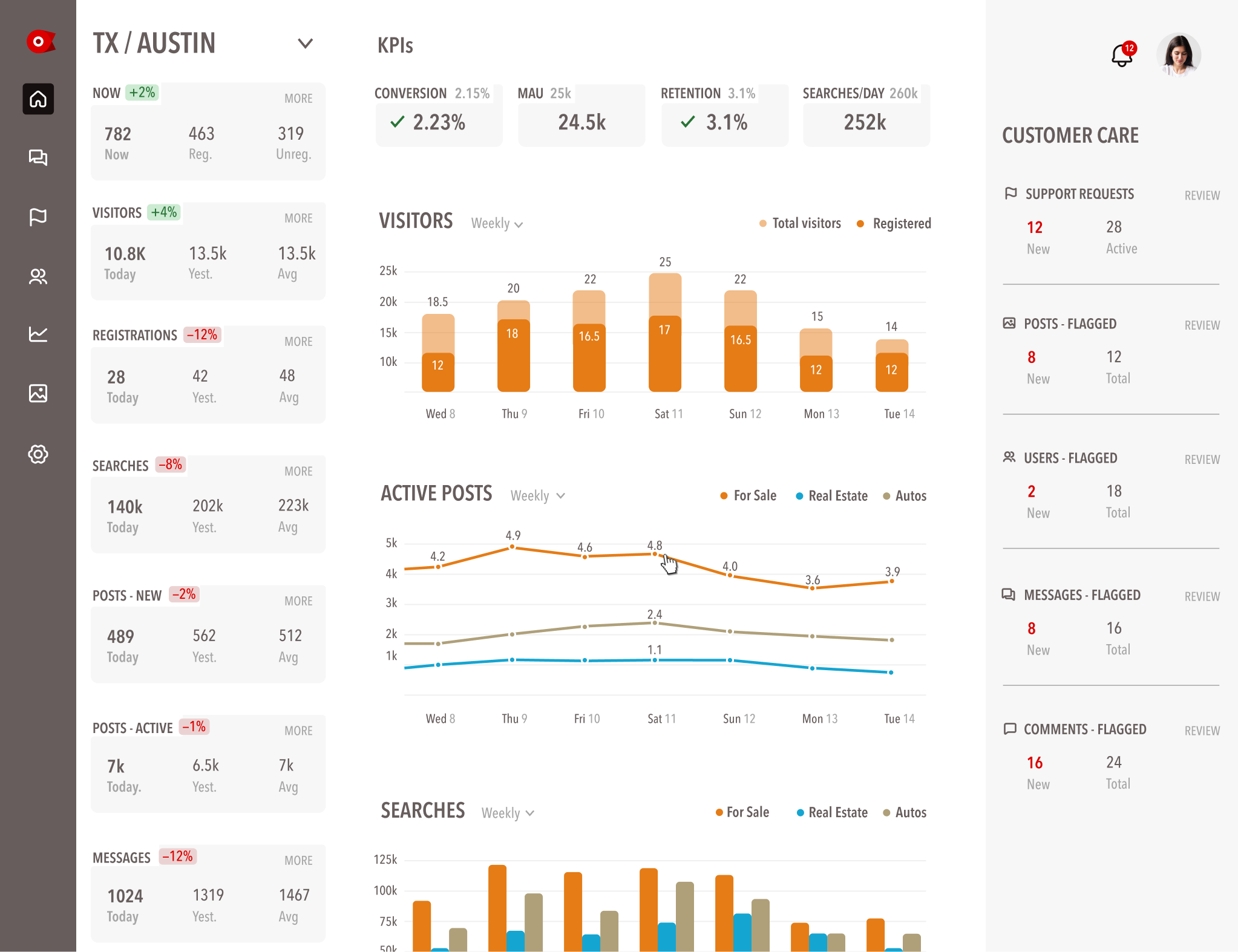
The dashboard highlights our KPIs with comparative data in the sidebar and quick links to critical areas
The logomark embodies key principles for the startup such as connection and targeting. See more in Logos.