Logos

Defining a Connection

An organization's logo is the leading point and the visual cornerstone of ongoing relationship.

As with all design work, identity design projects require that we enter deeply into the client's vision and the perspective of their audience as we craft the graphic that represents their connection.

For more about our identity design process see our naming work.

Identity

Role

Identity Design

1/6

Entry

As a fintech startup, Entry was focused on providing a better digital mortgage experience with innovative tools and a customer experience that felt more in line with finding your dream home

The app icon—the color fade from blue to deep orange captures both sides of the ideal home-buying experience: from calm to energized

The linear pattern, inspired by traditional currency, also suggests a fingerprint, highlighting the app's dedication to personalized solutions. The keyhole directly symbolizes entry but also hints at a view into a new home.

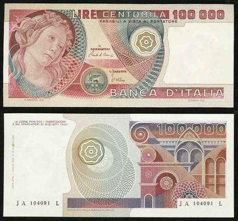
Foreign currency as inspiration

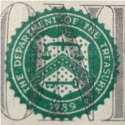
The silhouette of the logomark reflects the seal form found on paper currency—note also the key in the Treasury logo and its translation to a keyhole in the Entry logo

A weighty serif typeface feels both trustworthy and fresh, visually connecting the startup to traditional financial institutions while suggesting something new

2/6

Tesser

The mobile app brings two people together: one with a problem and one with experience in that area (and hopefully an answer!). In Tesser's unique environment, the interaction happens in real time over video with topics ranging from plumbing to parenting.

The logomark, generally presented in the form of the app icon, highlights the connection experience that happens across any distance

The branding remains open to the wide range of potential topics by occupying two poles: a slightly playful warmth with a more technical edge

The inspiration for the name was drawn from the book A Wrinkle in Time which also features the playful and the technical

The shifted form of the wordmark illustrates a version of tessering in order to bring two circuitous paths together

The colors of the rings change in each environment, highighting the variety of connections being made

3/6

Wild Leaven Bakery

Master baker Andre Kempton prefers to work by hand and relies on wild-harvested ingredients, so the identity for the organic-leaning cafe needed to include a wild edge balanced with a clean feel

The logomark draws its three-armed form from the Celtic trinity knot, an important influence for the baker

Signage includes boards used for the local farmers market

The logoform is composed of modular yeast grains, the building blocks of the bakery's trademark sourdough

4/6

Building With Heart

Alternative builder Chuck Bell brings 15 years of experience to his projects, enabling him and his crew to generously balance personal, technical and environmental needs. A primary challenge in the project, and hopefully its success, is the representation of "heart" in the largely masculine context of the building profession.

The typography balances bold, classic lines with warm details, while at small sizes the heart outline of the logomark becomes clear

At larger sizes the asymmetrical logomark suggests two hands at work, as well as the natural forms of a branching tree (nature & wood) and a grain head (used in strawbale construction)

5/6

klaza

Simplicity and clarity are two keys in the approach of the online classifieds startup, so the logo communicates both principles along with an energy that instills confidence

Bringing together buyer and seller from different locations

6/6

Phillips ADR

Following the firm's commitment to "A relentless approach to resolution," the logomark stands between the title's two words (the name and the acronym, the bold and medium, the first and the last, etc), uniting them while paying full respect to each.

The round form in relationship to the type hints at the rising sun, a reference to coming clarity.

The underlying form feels disordered and full of competing interests

The unifying ring not only brings an overriding order, it also reveals a target

At the center of the mark, a subtle eye form suggests seeing and wisdom

Details for the backlit interior signage